Tuesday, May 1, 2012
Friday, April 20, 2012
Ben Thomas: CityShrinker
To learn more about my inspiration for this project, you can view my PowerPoint presentation on Ben Thomas here.
Sunday, April 15, 2012
Tilt Shift: First Successful Attempt
So, for this, I took an old picture I had from a trip to Chicago over Winter Break that had the right perspective.
I had to crop out the building on the left because it looked a little strange for just a couple stories of it to be in focus, detracting from the overall effect. I really like the way the shop fronts and cars at the light work, I think that came out very well. However, the foreground, or bottom of the picture, is very empty and just... blah. I had tried cropping that out too, but then the street lights in the middle of the picture looked strange cut off at the bottom. In the future, I'll try to make sure my photographs have more going on throughout the entire image.
In the end, I'm pretty happy with the final result. I could certainly use some more practice to get the perfect look, but I think I'm on the right track.
Tutorial used: http://photo.tutsplus.com/tutorials/post-processing/tilt-shift-photoshop/
Before |
![]() |
After |
I had to crop out the building on the left because it looked a little strange for just a couple stories of it to be in focus, detracting from the overall effect. I really like the way the shop fronts and cars at the light work, I think that came out very well. However, the foreground, or bottom of the picture, is very empty and just... blah. I had tried cropping that out too, but then the street lights in the middle of the picture looked strange cut off at the bottom. In the future, I'll try to make sure my photographs have more going on throughout the entire image.
In the end, I'm pretty happy with the final result. I could certainly use some more practice to get the perfect look, but I think I'm on the right track.
Tutorial used: http://photo.tutsplus.com/tutorials/post-processing/tilt-shift-photoshop/
Tuesday, April 10, 2012
A Trip to the International Center of Photography: Greg Girard
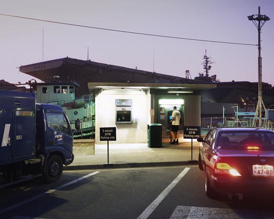
ATM and Aircraft Carrier, Yokosuka Navy Base, Japan, 2008 |
All of the collections were very interesting, but one that really caught my eye was Greg Girard's collection of pictures from Japan. He took them at various American Army and Navy bases and documented how the bases can seem like a little slice of the U.S., even on the other side of the world.
The first picture that caught my eye (above), did exactly just that.Upon first glance, it looks like a picture that could have been taken right here in America. The familiar late night ATM window with 5 minute parking just outside. The Pepsi truck parked there, perhaps filling up a nearby vending machine. With a quick glance, no one would question its location. Certainly, the aircraft carrier isn't as ordinary as the rest of the scene, but a naval base in America certainly isn't questionable. The one thing that gives it away is the license plate on the car. With the rest of the night-time photography giving off a blue, purple, or green hue, the reds and oranges of the car's taillights really draw the eye. In this picture, the license plate is the one thing that suggests to the viewer that maybe this photograph wasn't taken in the country he or she originally thought it to be in.
Photography Studio Display, Okinawa, Japan, 2009 |
This next photograph has quite a different effect. When the viewer first sees it, it is easy to ascertain that this store front may be located in an Asian city. Upon closer inspection though, one will notice that one of these framed pictures is not like the others. Despite being dressed in traditional Asian clothes, the larger family portrait on the left is of an American family, unlike all the other portraits in the display. The lighting highlights the American family, and their picture more prominent. In addition, the white matte and thin frame accentuate it more than the portraits on the right with darker and more muted colors. Also, being located in the center of the picture draw the viewer's eye.
Overall, Girard's photographs were quite interesting, and I think the subject matter really made the photographs fascinating.
Wednesday, April 4, 2012
Final Project Proposal: Tilt-Shift Photography
Ben Thomas |
After the research, I plan to have a series of 3 to 5 prints. The subject matter is yet to be determined, but I would like to focus on looking at a setting I am very familiar with in a new way. Potential subjects for the shoot are:
- The College of New Jersey
- Bridgewater, New Jersey (my residence for the past 12 years)
- Morris Plains, New Jersey (where I lived most of my early childhood)
To guide my research, I will be examining the works of Ben Thomas.
Noa Emberson |
April 5 - 22 Shooting
April 18 - 25 Post Production
April 25 - May 1 Printing
Useful Links:
http://bryansolarski.viewbook.com/album/little_world?p=1&s=UA-16761192-4#1
http://tiltshifted.com/
http://www.flickr.com/groups/tilt-shift-fakes/
http://www.flickr.com/groups/tilt-shift1-2miniatures/
http://creativefan.com//10-tilt-shift-tutorials-for-photography-and-photoshop/
http://visualphotoguide.com/tilt-shift-photoshop-tutorial-how-to-make-fake-miniature-scenes/
http://www.thephotoargus.com/inspiration/35-examples-of-amazing-tilt-shift-photography/
Tuesday, March 27, 2012
Final Image: The Death of Painting
Lighting played a huge role in this project and I think that's where I learned the most in this recreation. I checked out a light kit from Kendall's equipment facilities and even though I didn't have any gels, I bounced the light off of different colored paper to achieve the effect I was going for. I was really looking to bring a warmth to the piece, so I used orange paper to reflect the light. After much playing around (and a few too many shots that made the set look like it was supporting a bad fake tan) I finally found the right balance.
This project was much more pre-production heavy than any of the other projects I've done so far and that made me realize how important time management is. Not only did I have to factor in time to build the set, but also time to find the materials needed. I didn't paint the building early enough, so while shooting I was still adding more coats of paint. Under the bright lights you could still see the Pop-Tarts logo through the light-colored paint, which then, in turn, left me with more post-production work than I had originally intended.
Sunday, March 25, 2012
Tuesday, March 13, 2012
Pre-Planning: The Death of Painting
For this project I plan on recreating Cezanne's Chestnut Trees.
To do so, I will reconstruct the scene in miniature using items found in nature, such as sticks for the trees in the foreground, leaves for trees in the background, dirt for the path, and rocks for the wall. The background will be painted on white paper and the building will be constructed out of cardboard and paint. As for the grass, I am unsure yet as to what material will be used. The final construction will be photographed in the lighting studio. Below are images of different materials I will use, as well as a very rough set up of the foreground trees.
Rough layout of Trees. Final set-up will be wider. |
Possible background tree #1. |
Possible background tree #2. |
Dirt for the path. |
Sunday, March 11, 2012
Panorama: Final Image
Stitching together a panorama turned out to be a whole lot difficult than I expected. Especially since I wasn't able to use a tripod due to such a low camera angle. After many reshoots of the same scene, I finally got a set of images that I could successfully piece together. In this project, I also learned to use a lot more tools in Photoshop than I had ever before. The clone stamp was a HUGE help on the stump and in the grass.
In the end I was very proud with the finished result. I was really glad that I decided to bring the animal and dinosaur figures into a makeshift landscape as opposed to shooting them in the lighting studio (even if that meant many hours more spent working in post). It added more character and story to the overall image.
Sunday, March 4, 2012
Wednesday, February 22, 2012
Friday, February 17, 2012
Sunday, February 12, 2012
Jean-François Rauzier
Jean-François Rauzier creates fantasitical, surreal panoramas out of seamlessly interlaced images. Countless hours go into creating these gigantic images (the one above measures in at 32' by 66'), but for Rauzier the creation of these Hyper-photo dreamscapes combine all of his favorite artistic mediums.
Rauzier takes close up photographs of every subject within a composition himself, allowing for much more clarity and detail than one would expect from a photograph so large. His works encourage viewers to get up close and personal with the piece, inviting them to look closer at every detail."I agree that it may sound crazy, but I've been a photographer, painter and sculptor for 30 years, exploring these different techniques of expression up until 2001. At that time, I began my Hyper-photo work and I haven't needed to do anything else. I'm entirely satisfied. As a photographer, I can use this powerful art medium to capture reality. As a painter, I can control my image exactly and put what I want where I want. And as a sculptor, I savor spending a long time on my work, as a meditation, to have the pleasure to approach, touch and feel the texture, then back away to see the entire work. Hyper-photo is a combination of all of these.”
To take a closer look at his work, check out his website, www.rauzier-hyperphoto.com.
Sources:
http://www.digitalphotopro.com/profiles/jean-francois-rauzier-the-image-is-in-the-details.html
http://www.rauzier-hyperphoto.com/bibliotheque-ideale-3/
Tuesday, February 7, 2012
Monday, February 6, 2012
Research: William Eggleston
Born July 27, 1939, William Eggleston is often noted as a “pioneer” of color photography. He got his first camera when he started college in 1957, and about ten years later he began to bravely explore the world of color photography while most others sat comfortably in a world of black & white. Despite criticism from his peers for not sticking with the familiar, he continued to experiment with color and light.
Eggleston’s work takes the ordinary and makes it extraordinary. He photographs common, every day events and objects and turns them into works of art. His brilliant use of color and composition sheds new light on his subjects.
His works can be considered a series because of the similarities in theme and style. Thematically, Eggleston concentrates on the ordinary, whether it be a piece of garbage, a street sign, or a person, and depicts them in a new way. Stylistically, his pictures are bold and bright, showing the world in brilliant hues.
Sources:
Tuesday, January 31, 2012
Subscribe to:
Posts (Atom)